
Unlimited graphs, one price
Track three numbers or three hundred — daily, weekly, monthly or yearly. Nobody charges you more for paying closer attention to your business.
Weekly statistics · Simple line graphs
Put your weekly numbers on a line graph and see which way you’re headed. Update it from your phone in under a minute, print it out, and hang it where you can see it.
3 graphs free, forever. No credit card.
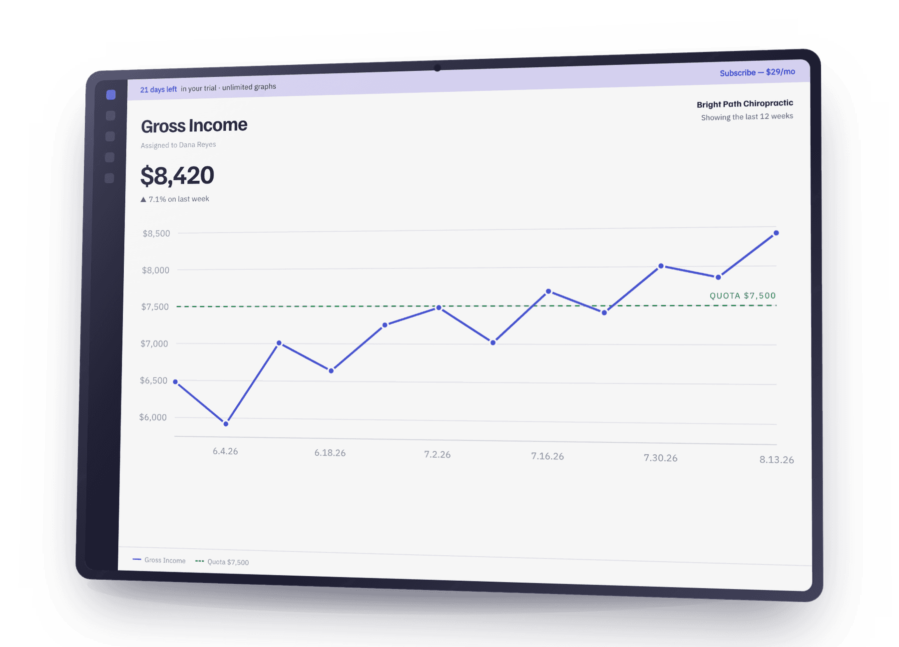
Sample graphs shown
Every business runs on a handful of numbers — money in, money owed, new customers, work completed. Written down each week and drawn as a line, those numbers stop being history and start being a direction. You can see a slide beginning while there’s still time to do something about it.
Knowing which numbers matter was never the hard part. Keeping up with them is. Marking your stats every single week takes consistency, and most tools make that harder than it needs to be. This one asks for about a minute.
Track three numbers or three hundred — daily, weekly, monthly or yearly. Nobody charges you more for paying closer attention to your business.
Clean, full-page line graphs with your company name on every sheet. Hang them on the wall, or email one straight to whoever needs to see it — no account needed at their end.
Your week closes, we email you, you type the numbers on your phone. Under a minute, wherever you are — which is the only reason a graph ever stays up to date.
No training, no consultant, no spreadsheet you have to babysit. If you can type a number into your phone, you can run your business off graphs.
Three graphs are free. Unlimited is one price, whether you keep four or four hundred.
Phone, tablet, laptop; same account, nothing to install.
Print for the wall, download, or email a set to a client.
Start with three and see if you keep up with them. Most people do. When you want a fourth, it is one price for all of them — and paying for the year makes it cheaper.
Free
$0
3 graphs. Free forever.
No credit card.
Monthly
$29 /mo
Billed every month.
Cancel any time.
Yearly
$20 /mo
$240 billed once a year.
Two months free.
The questions worth asking, answered properly.
A spreadsheet can draw the same line — that was never the problem. The problem is that updating it every single week is a chore nobody defends, so it quietly goes stale and stops being something you steer by. This asks for about a minute, reminds you when the week closes, and prints clean enough to hang on a wall. If yours is genuinely current every week, keep it — you don’t need us.
Yes. Three graphs, free, with no time limit and no card. If you want more than three, unlimited graphs is $29 a month or $240 a year. There is no setup fee and no per-graph charge.
No. It is month to month and you cancel yourself, in two clicks, from inside the app. If you pay yearly and leave partway through, you keep access until the year you paid for runs out.
They stay exactly where they are. If you have three or fewer, nothing changes at all. If you have more, the account goes read-only: you can still open every graph and read every number, you just cannot add new ones until you subscribe again or delete down to three. Nothing is deleted for non-payment.
That is the honest risk with any tracking tool, and it is worth naming. Two things are built specifically against it: an email when your week closes so it is not on you to remember, and an entry screen that takes under a minute for every graph you keep. If a week gets away from you, you can backfill it later — the graph does not punish you for it.
No — one person is the simplest version of it. Skip the company name, keep three or four numbers, and you get the same weekly line. Plenty of one-person businesses run on exactly that.
Three graphs free, forever. No credit card, and nothing to uninstall if you decide it isn’t for you.

